Basetool has delivered solutions to businesses and organizations in the hospitality industry, culture and the public sector for over 15 years.
Introduction
In the ever-evolving landscape of the hospitality industry, culture, and the public sector, one company has consistently stood out as a beacon of innovation and reliability—Basetool. With a rich history spanning over 15 years, Basetool has been at the forefront of delivering cutting-edge solutions to businesses and organizations, empowering them to create, manage, present, and promote their ventures with unparalleled efficiency.
Client:
Basetool AB
Role:
Digital Designer & Art Director
Services:
Brand Identity, UI/UX
Year:
2022
The challenge
As the lead designer at Basetool, I embarked on a journey to redefine its brand and website. This rebranding was not merely a visual overhaul; it was a strategic endeavor to enhance usability, captivate audiences, and reflect the innovative spirit that has defined Basetool for so long.
Reimagining a popular product with such a large user base posed challenges. Consistency in design and scalability were prioritized within the new design system.



Branding
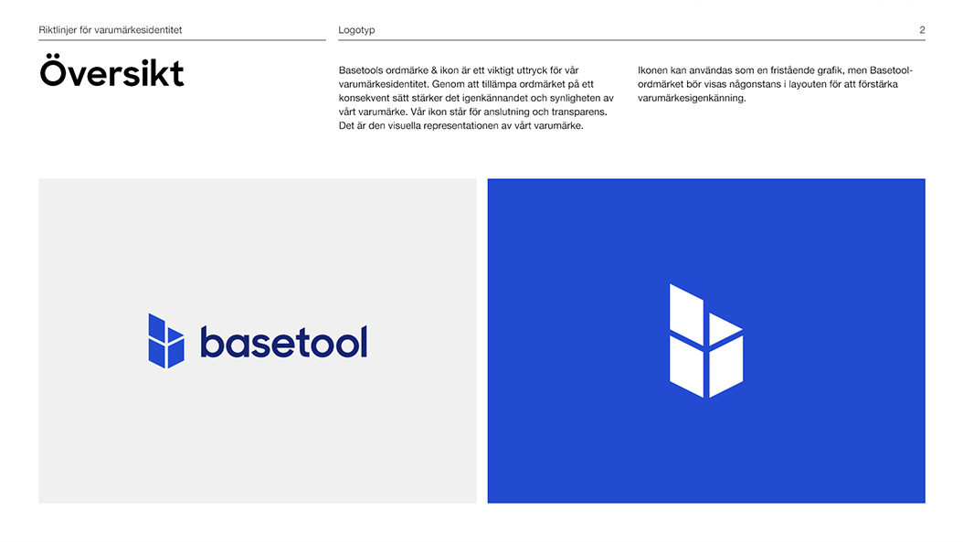
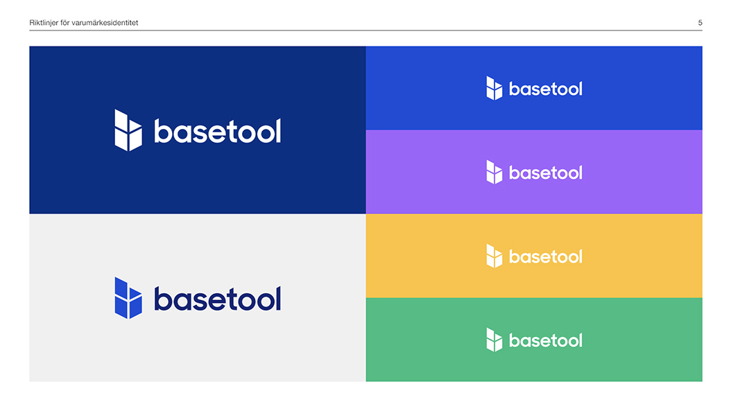
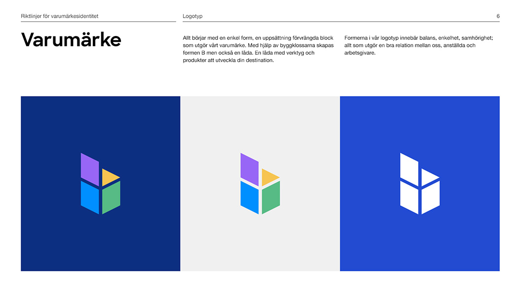
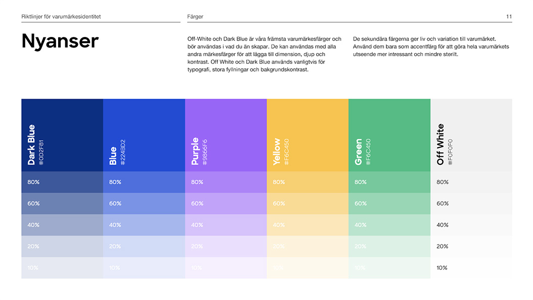
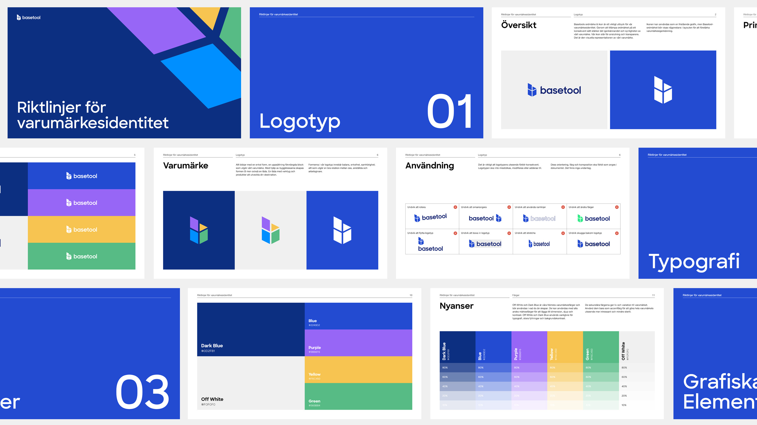
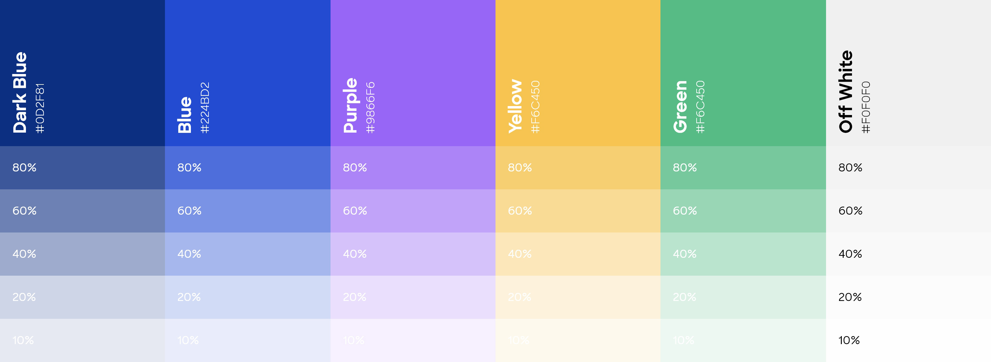
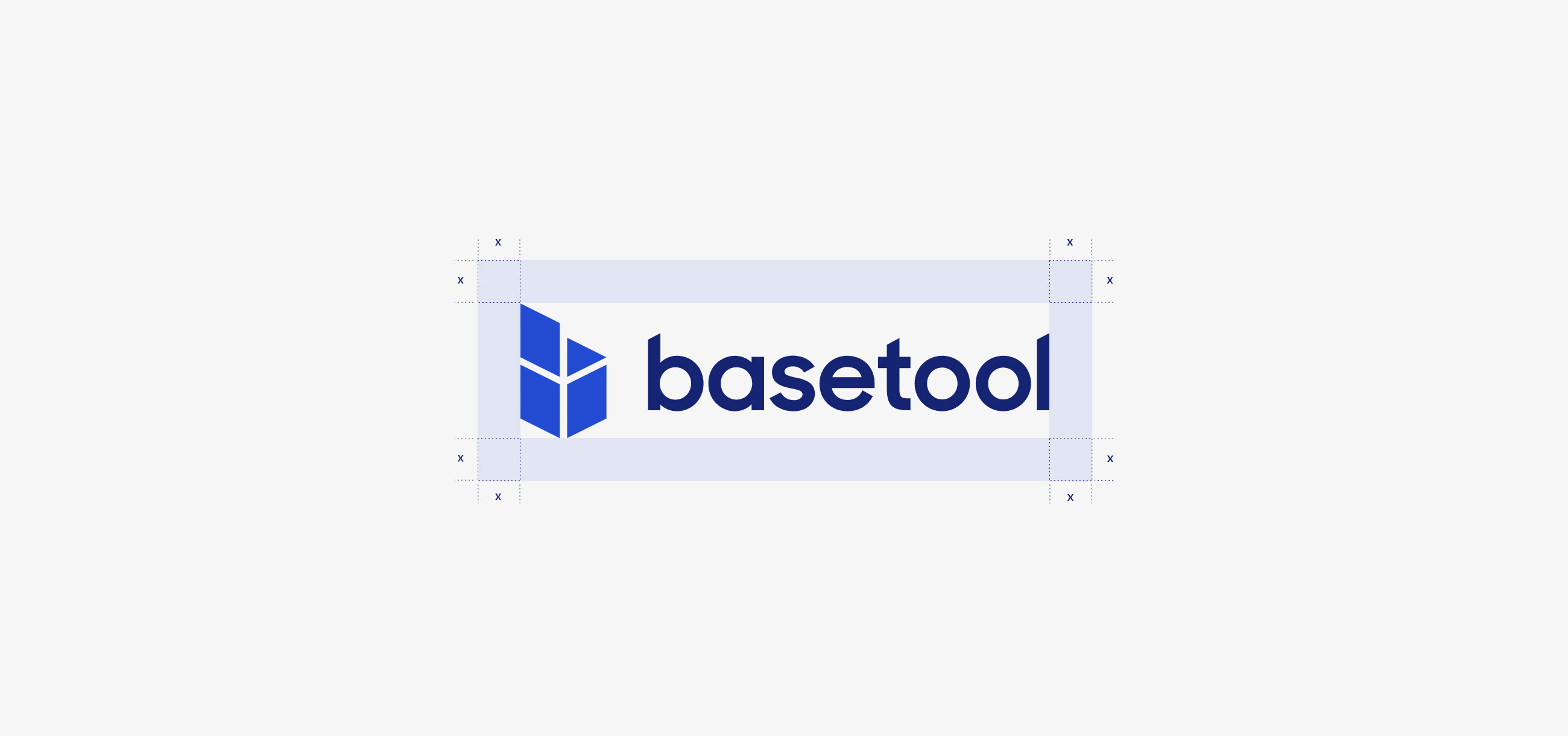
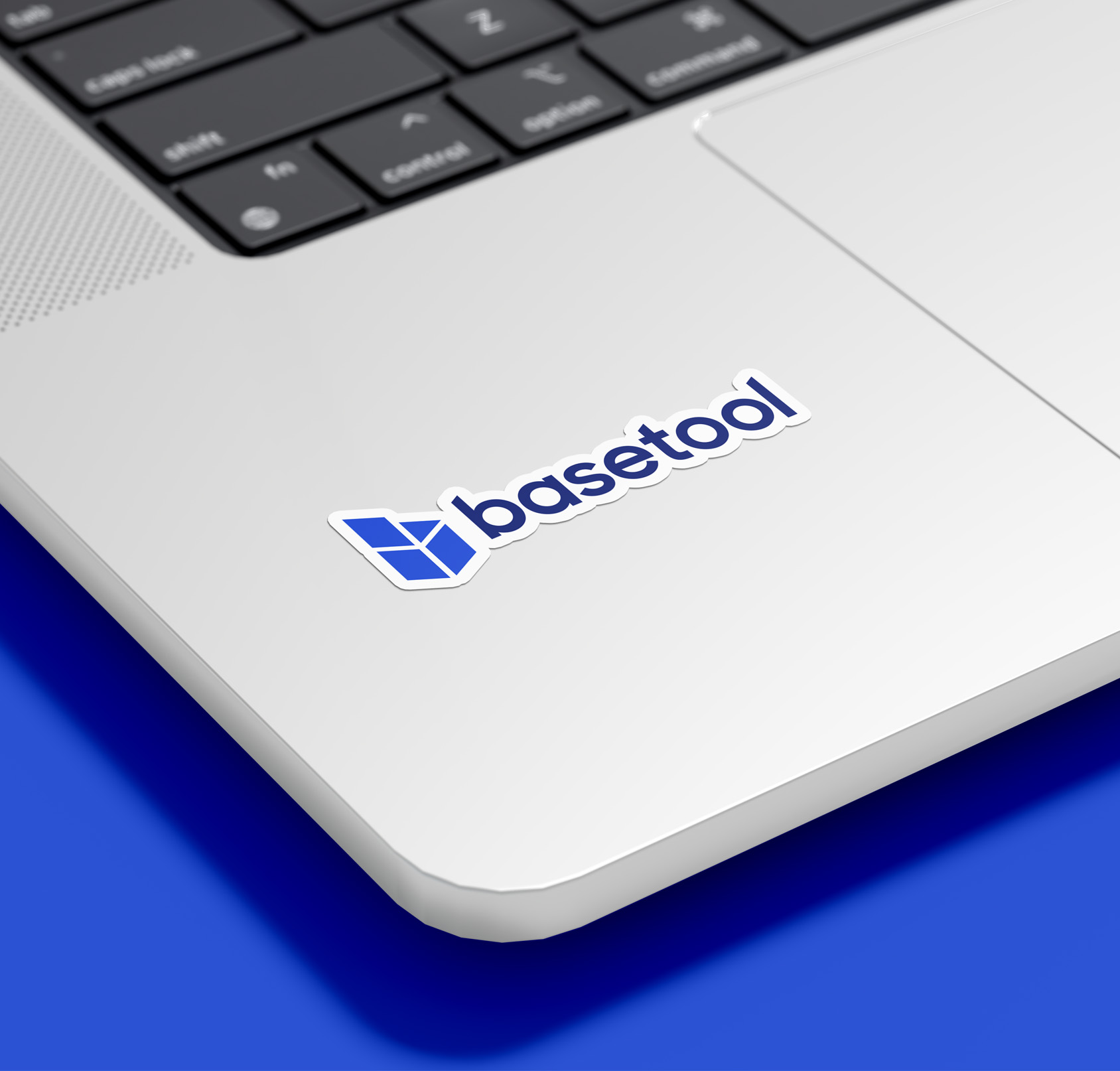
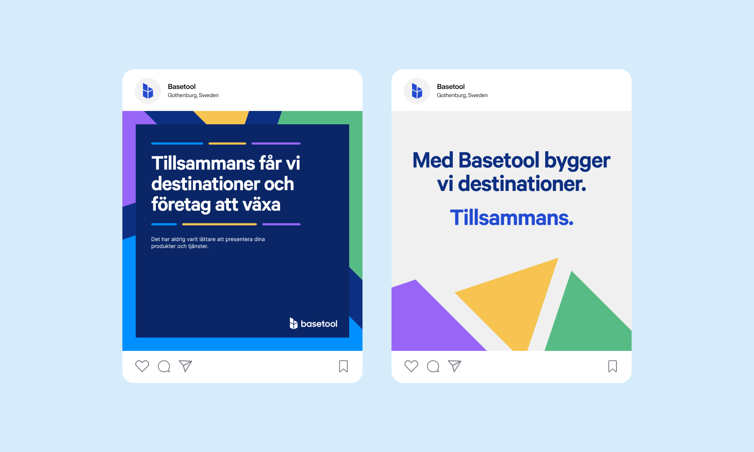
Basetool’s new visual identity is a harmonious blend of modern aesthetics and the company's longstanding commitment to excellence. A refreshed color palette, contemporary typography, and a dynamic logo reflect the brand's evolution while maintaining a connection to its roots. Consistency in design elements across the website fosters brand recognition and establishes a cohesive visual language.
Brand Guidelines
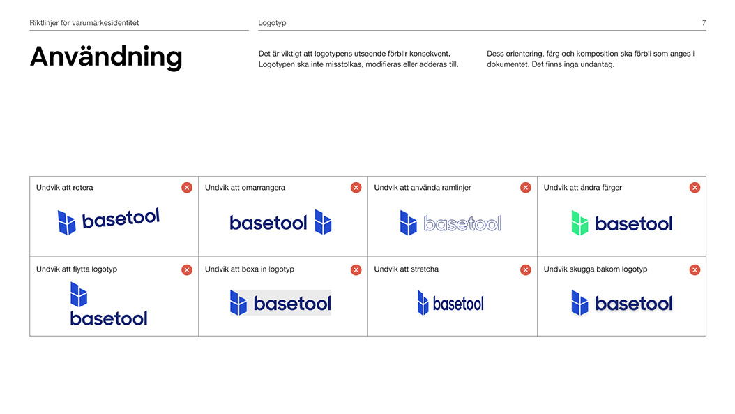
To ensure consistency across all Basetool’s visual assets, I developed comprehensive brand guidelines. The guidelines outlined proper use of the logo, typography, color palette, and other visual elements. I provided clear instructions on how to maintain a cohesive brand image across various platforms and materials, enabling Basetool to present a unified and recognizable identity to their audience.
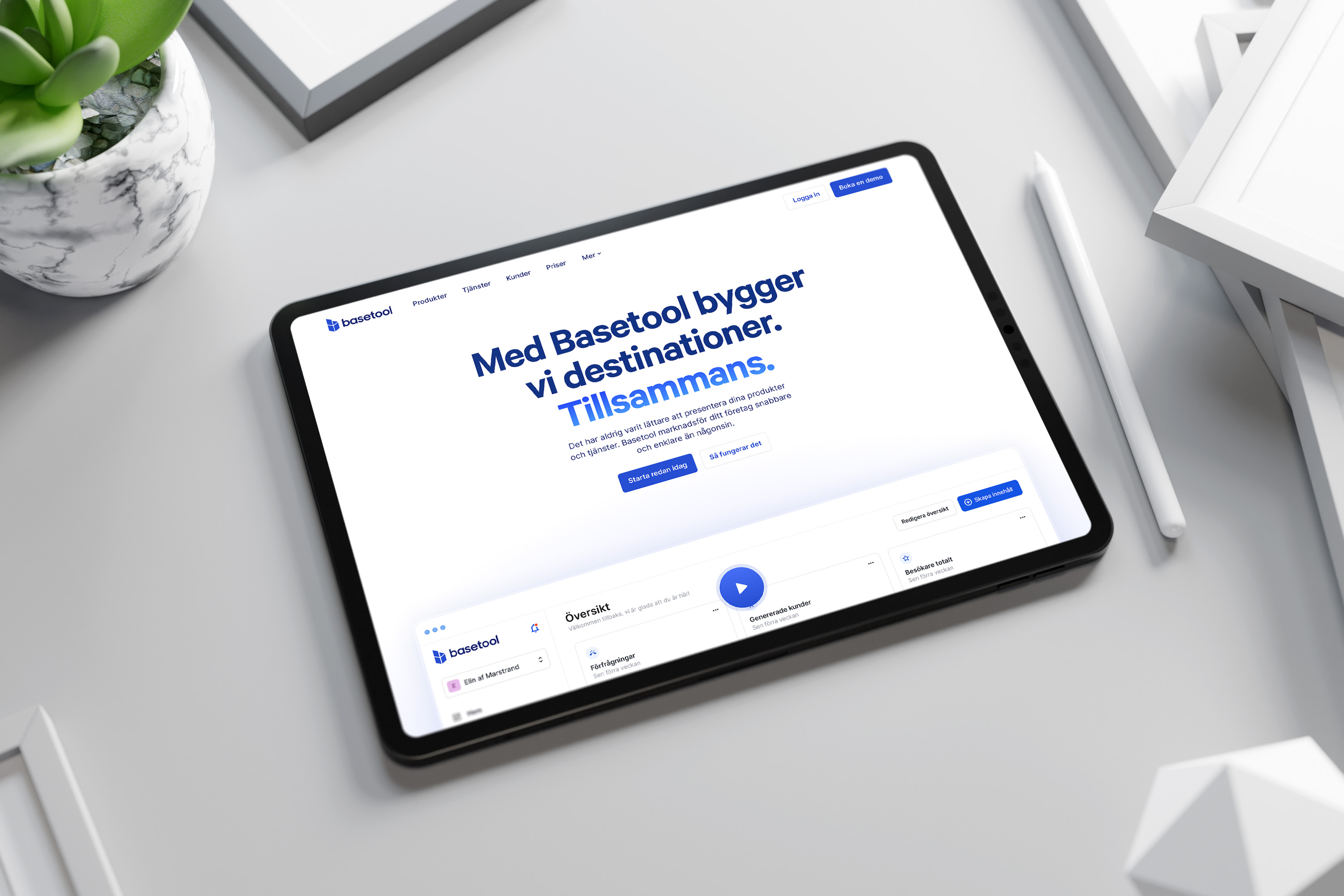
Website redesign
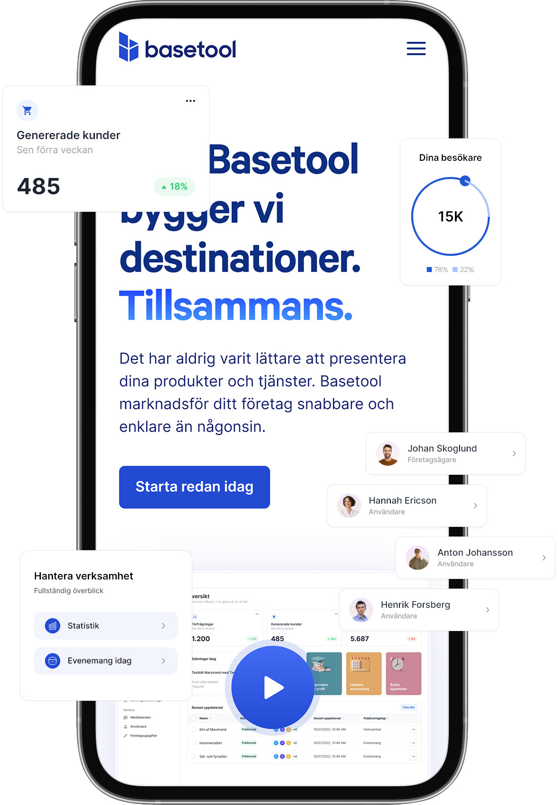
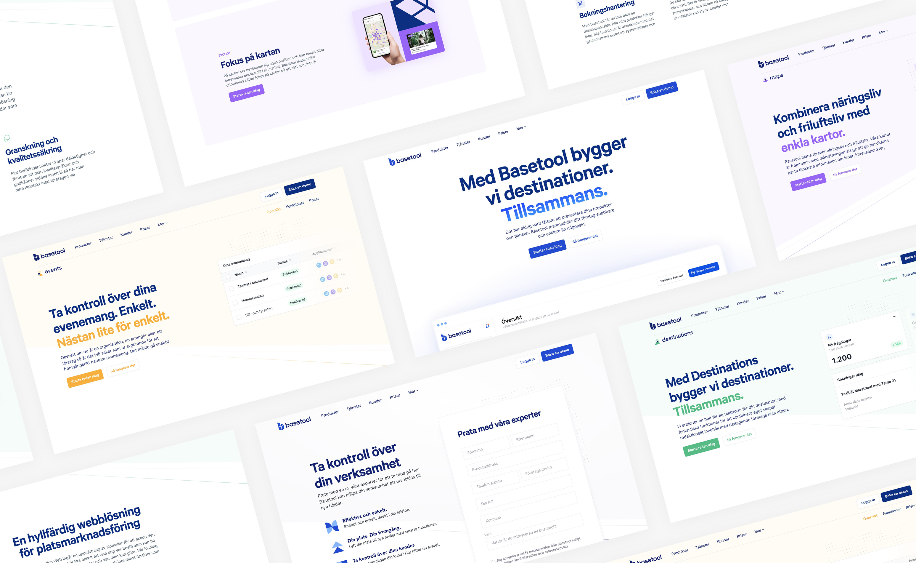
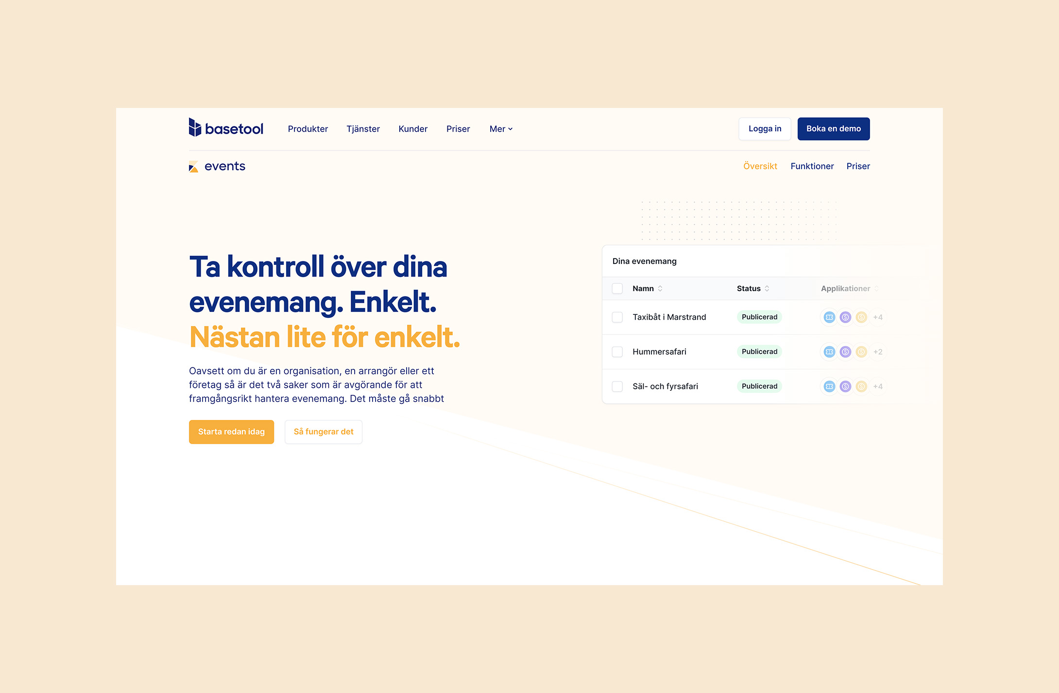
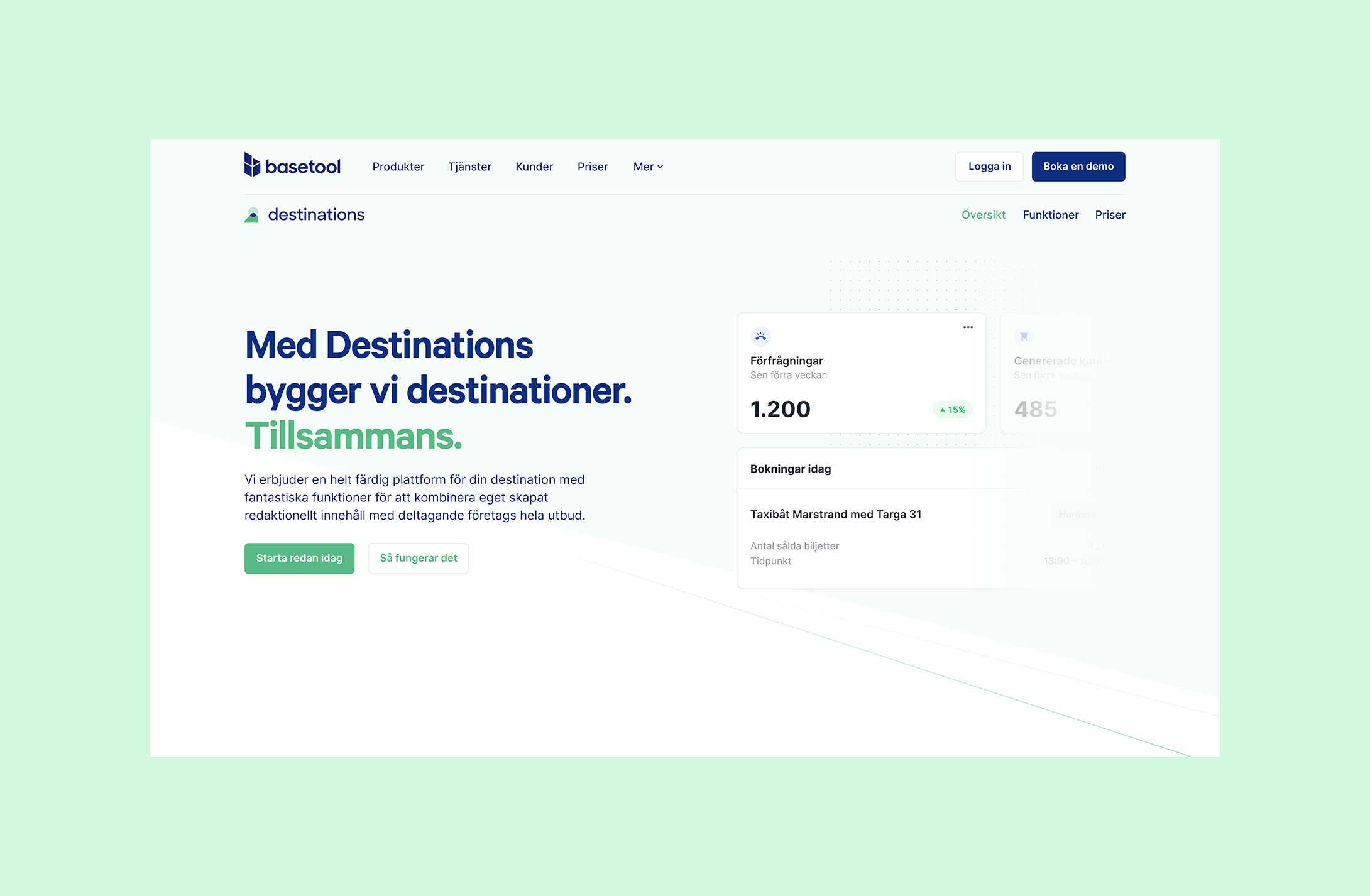
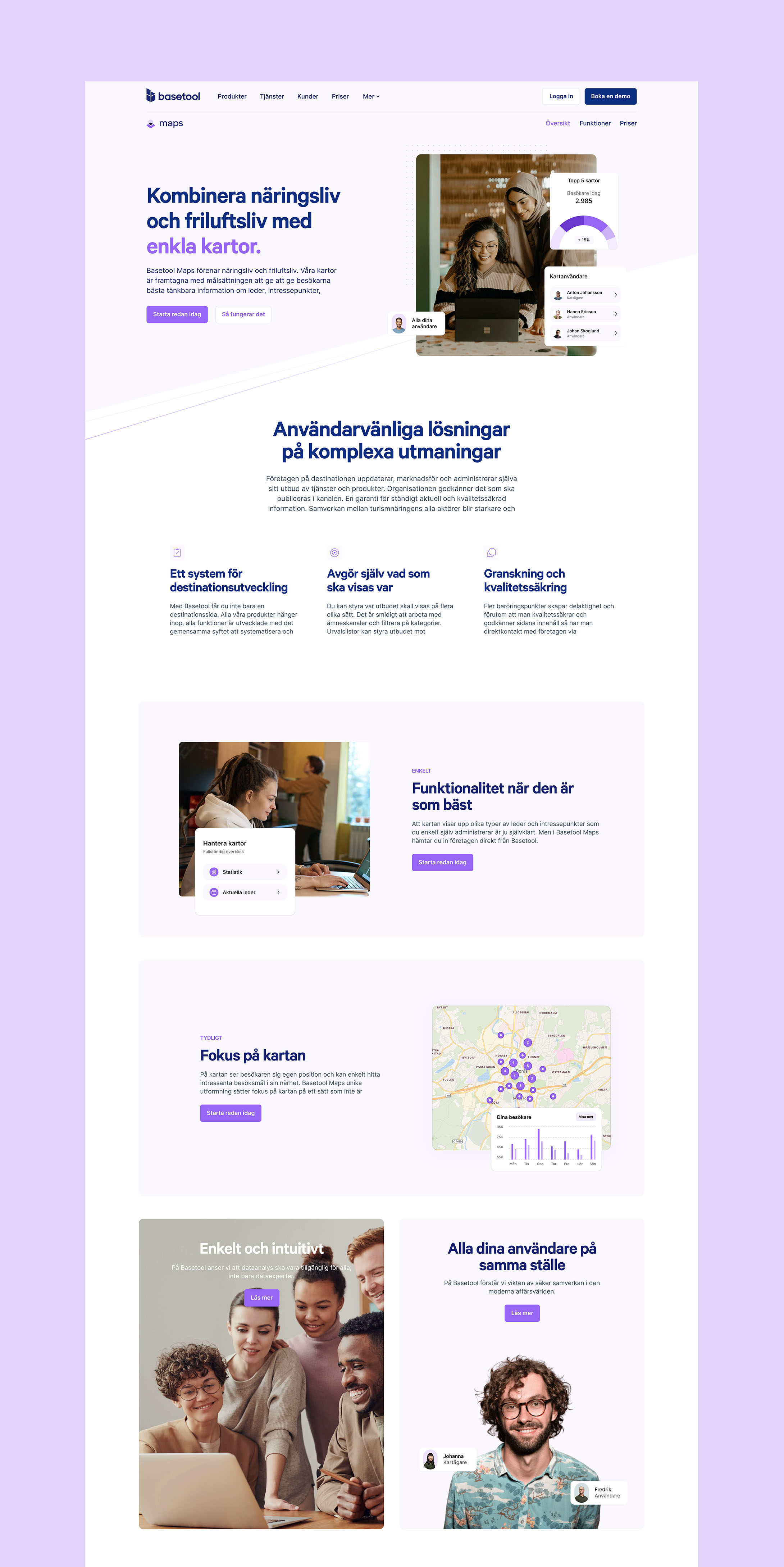
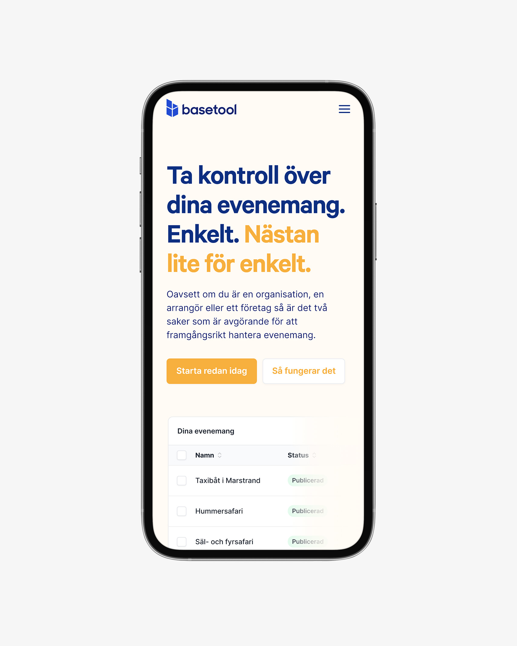
Strategic integration of brand colors plays a pivotal role in shaping user perceptions and experiences. The website redesign is a testament to this principle, where the brand guideline colors—blue, green, yellow, and purple—have been thoughtfully woven into the fabric of each page, particularly enhancing the product pages for company products such as Events, Destinations, Maps, and more.
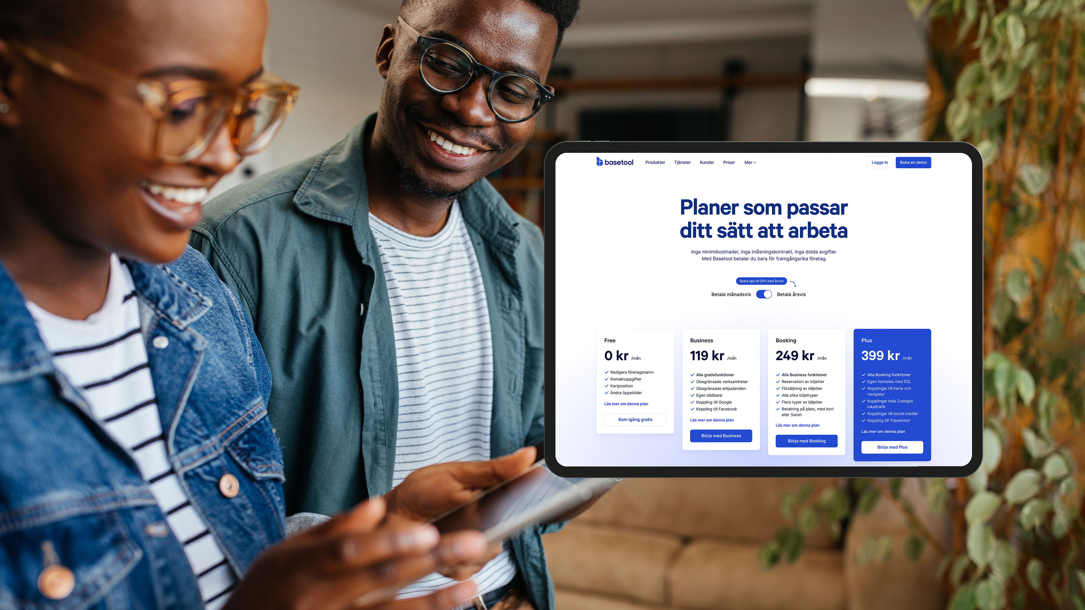
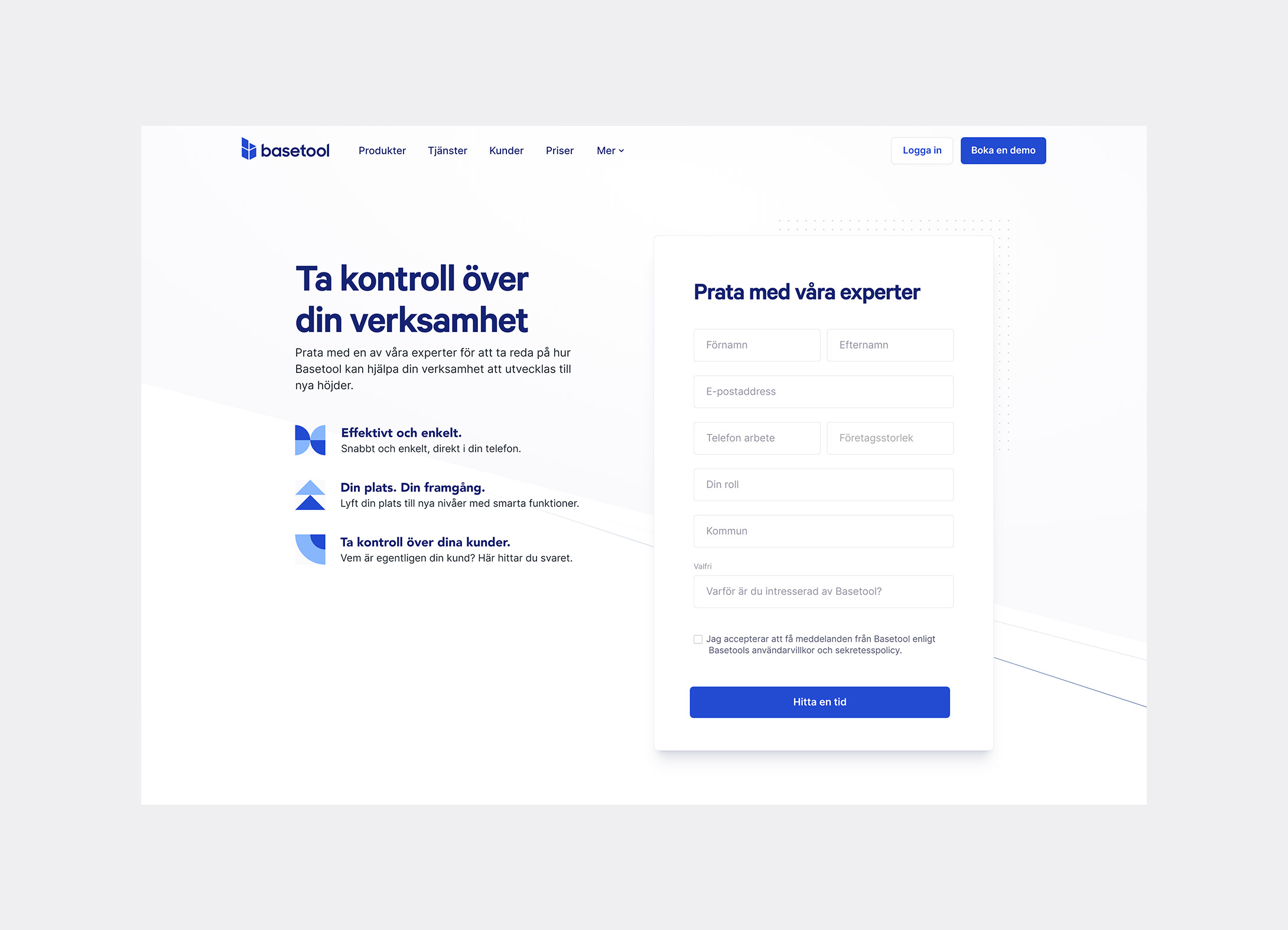
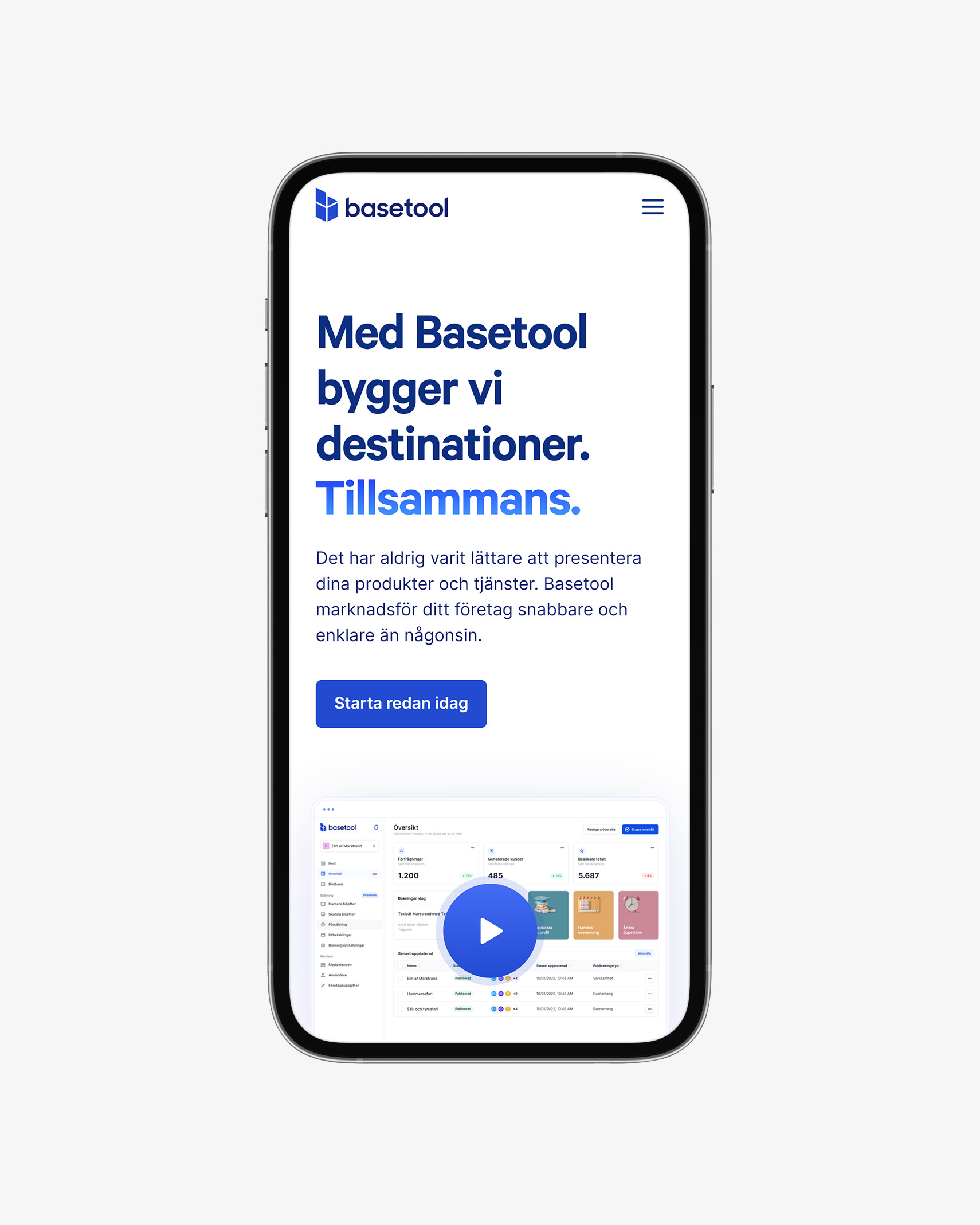
These final design incorporated the brand’s modern and innovative identity, paying close attention to typography, imagery, and interactive elements.
Got a project in mind?
Let’s talk.
